Infographic resumes have become a popular trend among job seekers. You may recall the viral posting of former Yahoo! CEO Marissa Mayer, a vibrant mashup of purple icons and imagery meant to convey a compelling visual story. Alas – it was neither Marissa Mayer’s resume, nor would it have landed her an interview.
This is because Infographic resumes don’t work.
Sure, they’re an interesting visual solution that stands out among the traditional black and white resume format. But an effective resume goes beyond design – specifically into ATS compliance, readability, and appropriate presentation. For most job seekers, an infographic resume will not benefit your efforts.
Will a Designed Resume Help Me Stand Out?
Yes, having a flashy resume will make you stand out. For a second. And in a job-seeking world where a hiring manager takes 6 seconds to decide if you’re qualified by looking at your resume, that’s a good chunk of time.
But here’s the thing with graphical resumes – even the most beautifully designed ones lack certain criteria that hiring managers still want to see. They are difficult to read, and busy graphics can overshadow the points you’re trying to convey in your content.
Putting the extra emphasis on the design element may come at the expense of the overall message you’re trying to convey, and that’s a recipe for failure.
(Most) Infographic Resumes Are Not ATS Compliant
The format and presentation of the resume may prevent the Applicant Tracking System from accurately reading your resume, and passing it through the system. Graphical elements, text in the form of images, and tables are generally not readable by the ATS system, and using them in your design will render your resume ineffective.
“What’s the difference if they’re not reading my resume in the first place? At least having an interesting design will get them to look at it.”
There is a big difference between looking at a resume and reading it. The only people who might get away with a flashy infographic resume are creative industry professionals. And after 10 years of recruiting for that industry specifically, honestly, I’ve rarely seen someone get hired using one.
There are still a couple of creative tactics you can employ to give your resume a well-designed look that helps it stand out among a sea of black and white templates.
Use an Attractive Font and Format
You don’t want to be too liberal in your font choice for the body of your document because you want it to be easily readable. But you can deviate slightly with the font, style, and color choice for the header of your resume, i.e. your name and contact information.
However, use that creativity within reason. I’m a big fan of Helvetica Neue Light – it’s a crisp, clean, light font that gives a slightly stylistic and modern look to text, and I often like to play around with different shades of gray, or even a subtle color to add a little pop.

Use Imagery Sparingly
Don’t put unnecessary graphics on resumes or other documents. The one place you can integrate a more visual element is in displaying your social media profiles, phone number, even email address. Keep it small, one color scheme, and make sure it doesn’t detract from the rest of the document.
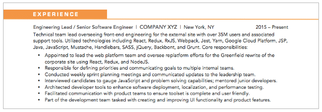
Subtle color and shading can be an effective way to separate out columns and organize different sections of information. Play around with a shaded table for the section header to incorporate a visual element.
Use Lines to Separate Sections
Incorporate a thin line to add color, highlight your section headers, and differentiate the different areas of the resume. Avoid adding thick lines or using overly bright colors that may draw the eye away from the content of the resume.
Be sure your use of elements is consistent in all sections. If you use a line to highlight one section, ensure that it appears uniformly throughout all other sections in the resume.

A creatively designed resume is only half the equation. It also needs to follow the “3 C’s of Content” – make it Clear, Concise, and Compelling.
Refer to the job description and use relevant keywords and language that speak to the skills, strengths, and experience you bring to the table. While an attractive resume will get you noticed, a well-written resume will get you the interview.
Need help? Contact us to ask about our personal branding and resume writing services that get you hired.
