
An infographic resume won’t necessarily help you get noticed by hiring managers. It may even hinder your job search efforts.
One of the biggest challenges with infographic resumes is that they are generally not ATS compliant. The format and presentation of the resume may prevent the Applicant Tracking System from accurately reading your resume, and passing it through the system.
Also, graphical elements, text in the form of images, and tables are generally not readable by the ATS system, and using them in your design will render your resume ineffective.
You can incorporate creative elements such as lines, color, and attractive font choices to make your resume stand out. Just make sure your resume adheres to the “3 C’s of Content”: clear, compelling, and concise.
There are still a couple of creative tactics you can employ to give your resume a well-designed look that helps it stand out among a sea of black and white templates.
Here are three examples that blend high-quality design with exceptional content, while following the rules for ATS compliance:
ATS COMPLIANT RESUME EXAMPLE #1
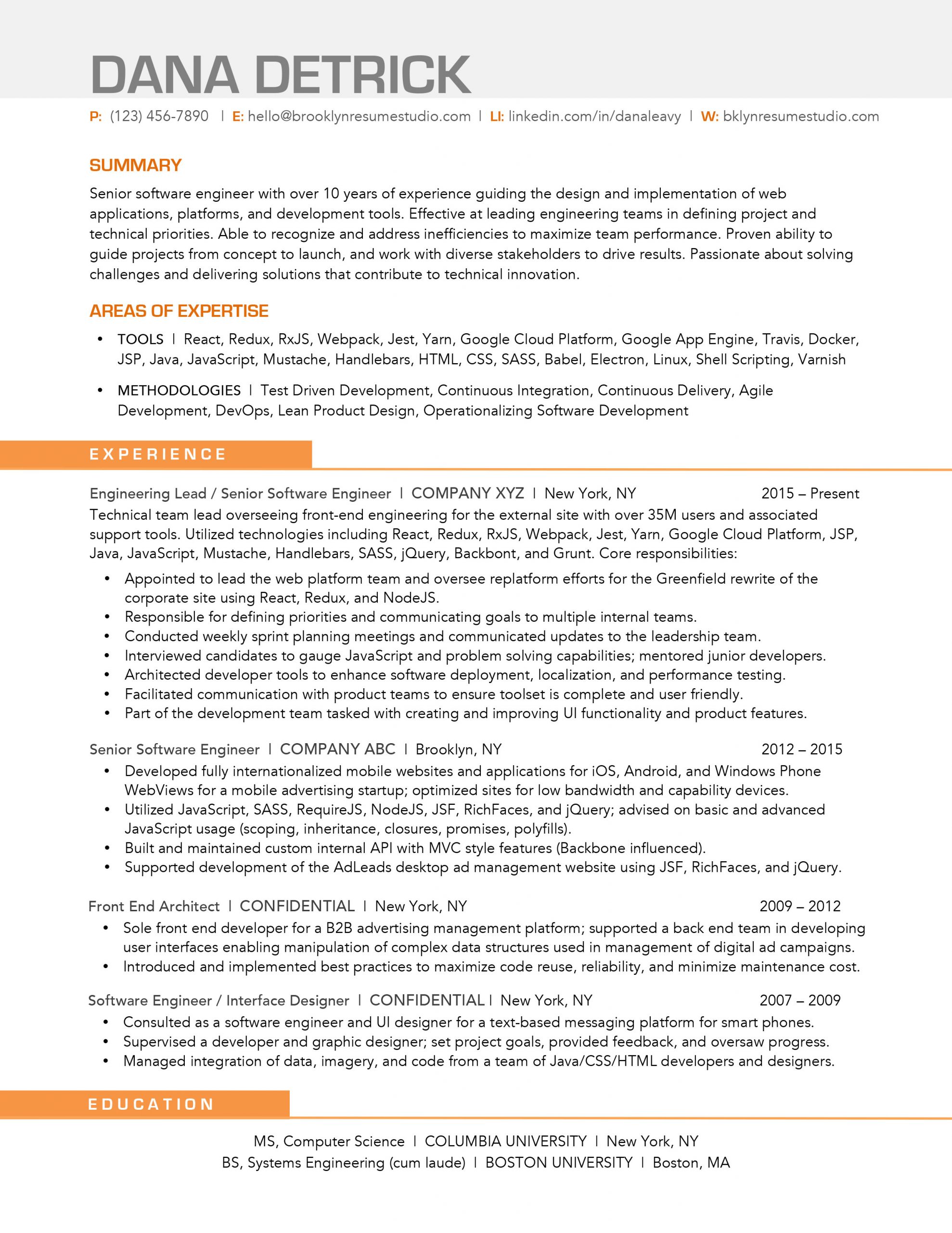
What Makes this Resume Effective:
- Using one color sparingly and strategically to highlight different sections.
- Using lines to separate the section headers and break up the resume for easy scanning.
- Including a text box in place of a table to add a subtle backdrop and interesting visual element at the top of the resume. Tables are generally not readable by ATS, but text blocks are.
ATS COMPLIANT RESUME EXAMPLE #2
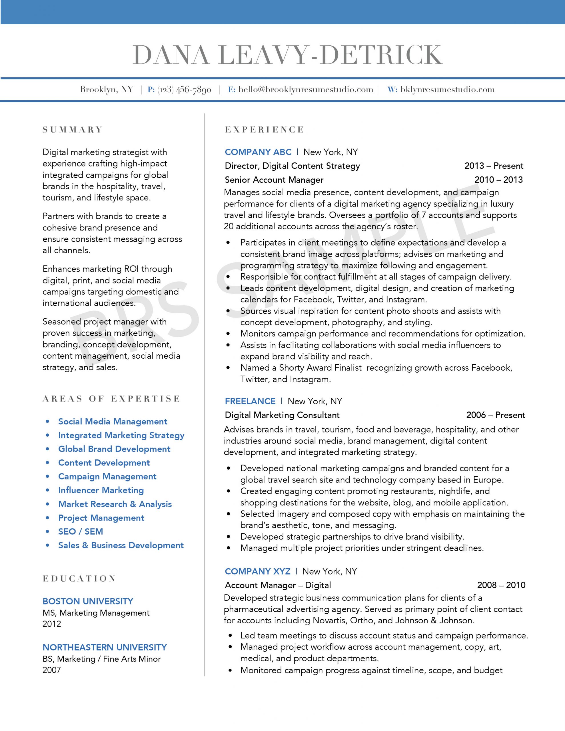
What Makes this Resume Effective:
- Using a two-column format makes the resume easy to read and scan.
- Employing lines and text boxes in place of tables ensures the resume is ATS compliant while creating opportunities to use color, weights, and visuals to make the resumes stand out.
- Contrasting colors effectively highlight sections and key phrases – such as job titles, company names, and core skill sets.
ATS COMPLIANT RESUME EXAMPLE #3
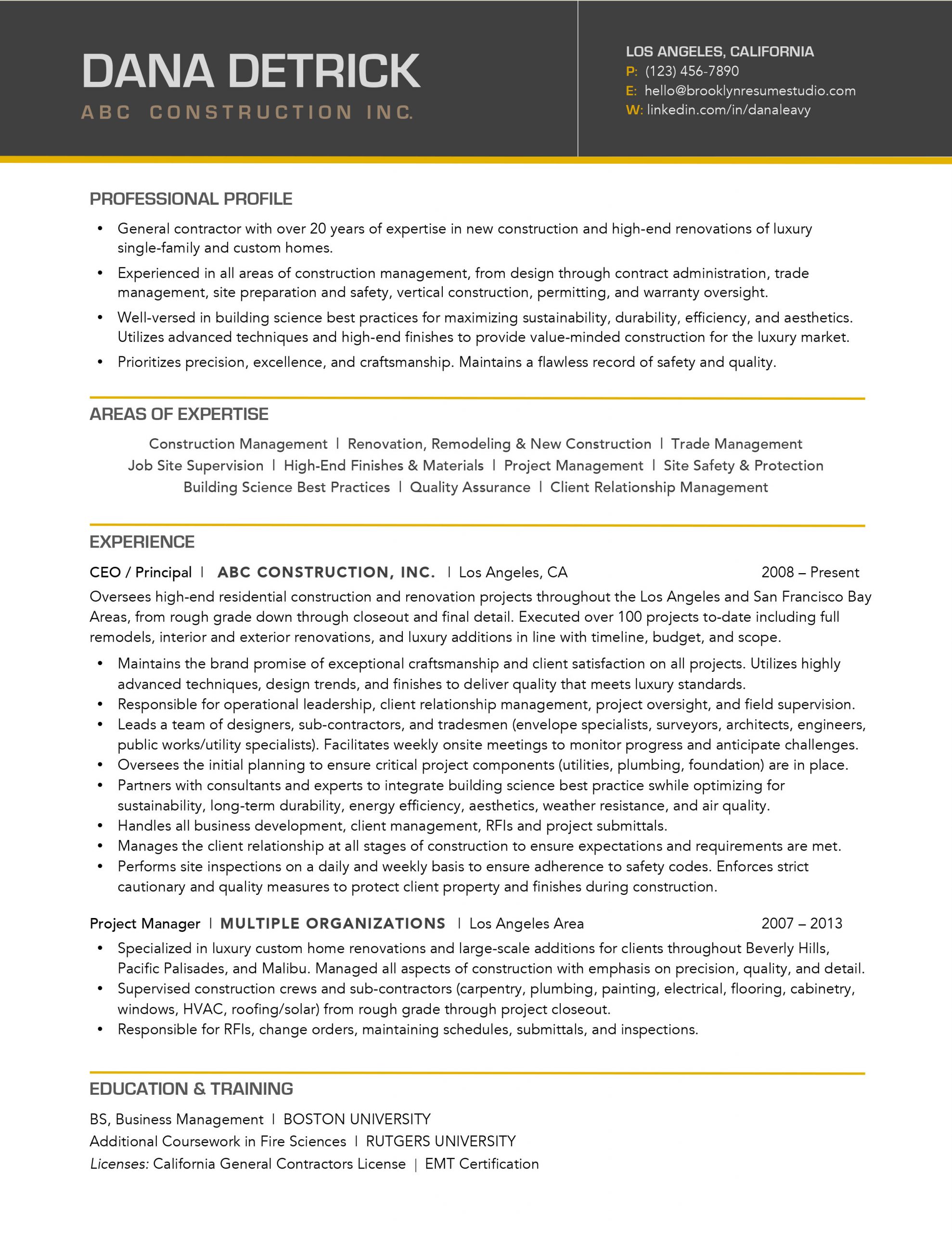
What Makes this Resume Effective:
- Contrasting header adds an interesting visual element while ensuring the resume is still easy to read.
- The “E-Style” formatting optimizes the layout for reading from left to right, which is more natural to the eye.
- The use of lines and bold fonts in the section headers make it easy to jump between areas of the resume without missing key information. It breaks it up into more digestible chunks that a reader can scan through.
All resume designs are copyrighted by Brooklyn Resume Studio. View more of our resume examples.